Image Compression Explained: How to Shrink File Size Without Losing Quality
Heavy images choke websites. They grind page rendering to a crawl, frustrate shoppers, burn mobile data plans, and quietly drag down search rankings.
Nobody wants grainy, artifact-riddled visuals on their storefront or marketing pages either. Creative directors, developers, and founders run into the exact same wall: do you protect visual fidelity, or do you chase sub-second load times?
Here is the truth: you do not have to pick a side. Master how image compression actually functions under the hood, and you can strip 70% to 90% of file weight while keeping the final asset crisp to the human eye.
The Anatomy of an Image File: What Are You Actually Compressing?
Every digital picture starts as a coordinate grid of discrete pixels. Each pixel stores numeric coordinates dictating brightness, color channels, and opacity across red, green, blue, and alpha channels.
Take an uncompressed 24-megapixel photograph. Storing 24 million individual points of raw, 24-bit color data turns into an unmanageable 72-megabyte monster before anyone even views it.
Effective compression never just shrinks dimensions down blindly. Instead, it reorganizes visual data mathematically, drops deadweight overhead, and recalculates the bitstream so your visitor's hardware downloads far fewer bytes without perceiving any drop in clarity.
Pixel Data vs. Hidden Overhead
Pop open an image file in a hex editor and you quickly realize it carries far more than color information. Cameras, editing suites, and phones pack dense chunks of non-visual metadata into every single file export.
Think about EXIF metadata, lens hardware profiles, shutter speeds, GPS coordinates, timestamps, and embedded ICC color spaces. On a tiny preview card or thumbnail, this hidden text overhead can easily eat up more than 30% of the entire file weight.
Stripping that hidden baggage changes zero rendered pixels on screen. You get an immediate reduction in transfer size without touching a single color value.
Why Raw Export Settings Bloat File Sizes
Creative applications prioritize archival safety over web performance. Exporting directly out of tools like Photoshop, Figma, or Illustrator on default settings leaves massive safety buffers baked into your files.
These factory exports preserve redundant tonal variations and bundle deep color tables that standard consumer monitors can't even render. What you get is an oversized asset that clogs networks, slows layout engines, and dings your Core Web Vitals.
Take control of your export pipeline instead of trusting software defaults. When you decide what stays and what gets dumped, you protect your performance budget.
Lossy vs. Lossless Compression: Finding the Visual Sweet Spot
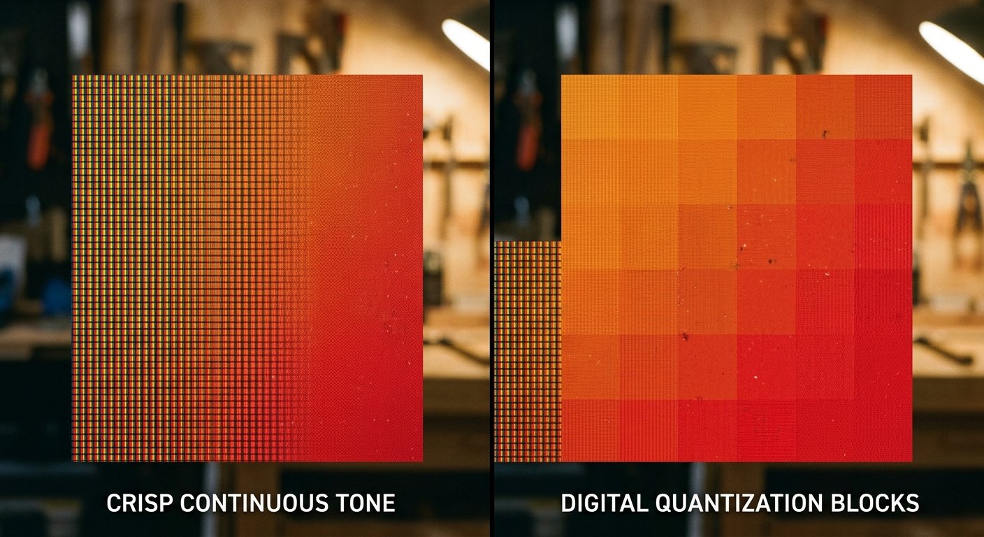
Every compression engine in the industry falls into one of two fundamental camps: lossy or lossless. Your choice between them determines whether your file maintains strict mathematical parity or undergoes calculated data removal.
Mix them up, and you end up with either muddy UI graphics or gigabytes of pointless data transfer. Let's break down the mechanics behind both systems.
How Lossless Algorithms Preserve Every Pixel
Lossless compression cuts file size without throwing away a single shred of visual fidelity. Think of it like a ZIP archive built specifically for visual data.
The engine scans the pixel grid for repeating patterns and runs of uniform color values. Rather than writing out "blue, blue, blue, blue" across every coordinate, it simply logs "four blues" and moves on.
Browsers unpack those instructions on the fly and reconstruct the image down to the exact bit. Formats like PNG and lossless WebP excel here, especially for technical diagrams, sharp line art, vector badges, and UI elements where soft edges look terrible.
How Lossy Compression Discards What Eyes Cannot See
Lossy compression permanently tosses subtle data out of the file. That sounds destructive on paper, but it is easily the most potent optimization weapon in web development when handled right.
These algorithms hunt down color nuances that the human optical system simply cannot distinguish. Rather than maintaining microscopic shade shifts across a complex sky gradient, the engine averages neighboring pixels into consolidated clusters.
Run your assets through the MakeMyVisuals auto compress tool to discard that unneeded data while locking down fine edges. Your overall file size drops off a cliff, but to your visitor, the photo looks untouched.
The Human Visual System and Perceptual Encoding
Human eyes process brightness with surgical sensitivity, but our perception of color variance is comparatively clumsy. Modern compression engines exploit this biological vulnerability on purpose.
Engineers separate raw brightness (luminance) from color channels (chrominance). The algorithm preserves high-frequency luminance values with razor sharpness while downsampling neighboring color channels through chroma subsampling.
Your visual cortex fills in the subtle chromatic blanks without skipping a beat. To your eye, the photo looks pristine, even though half the raw data was thrown out the window.
Modern Image Formats: JPEG, WebP, PNG, and AVIF Compared
Selecting the wrong file format sets you up for failure before you touch a compression slider. Containers built in the dial-up era simply cannot compete with modern encoding efficiencies.
Understanding which container fits your specific visual content pays massive performance dividends. Let's compare how modern web standards stack up in production environments.
When to Stick with WebP for Web Performance
WebP is the uncontested workhorse of production web development today. Engineered to modernize both legacy JPEGs and bulky PNGs, it supports lossy routines, lossless encoding, and transparent alpha channels inside one tidy container.
Expect a lossy WebP to come in 25% to 35% lighter than a standard JPEG matched to the identical visual threshold. It also handles subtle shadows and dark gradients without the ugly blocky banding common to older formats.
Browser support is virtually total across modern smartphones and desktop engines. Running your legacy libraries through our online format converter delivers immediate speed gains across every landing page you operate.
Preserving Transparency: PNG vs. Modern Formats
PNG was the undisputed king of web transparency for decades. The problem? Traditional 24-bit PNG files carry tremendous weight, often bloating into multi-megabyte payloads for basic visual assets.
Whenever you use an AI background remover to isolate team headshots or products, exporting an uncompressed 24-bit PNG will crush mobile load speeds. Switch to modern transparent WebP or run indexed 8-bit PNG compression instead.
That switch slashes file weight by up to 80% while retaining clean alpha cutouts across complex backgrounds. Your edges stay crisp, your backgrounds stay clear, and your network requests remain feather-light.
Format Conversion Workflows That Save Bandwidth
Smart media pipelines always pair file formats directly with visual content types. Rely on lossy WebP or JPEG for photography, lifestyle imagery, hero backgrounds, and detailed product shots.
Save indexed PNG or transparent WebP for brand marks, interface typography, product cutouts, and crisp geometric icons. Look toward AVIF for heavy editorial banners where you need maximum compression efficiency, provided your workflow can stomach slower build-step encode times.
Audit your media folders once a quarter. Converting uncompressed PNG screenshots into lean WebP files can wipe tens of gigabytes off your cloud delivery bills every single month.
Resolution vs. Compression: Why Resizing Comes First
One classic mistake trips up developers and content managers constantly: applying compression algorithms before adjusting physical dimensions. These two processes solve entirely separate engineering challenges.
Compression dictates how efficiently pixel data is packaged inside the file container. Resolution defines the actual width and height of the raw canvas grid itself.
The File Penalty of Downscaling via CSS
Picture this: your DSLR spits out a 6000x4000 pixel product shot. Drop that file straight into WordPress and resize it down to 600x400 with CSS rules, and your visitor still downloads all 24 million pixels over their mobile connection.
The user's mobile CPU has to catch that massive asset, decode the giant payload, and downsample it in memory on the fly. You burn through their data allowance, cook their battery life, and trigger visible layout delay.
Resize before you compress. Run your high-res originals through an image resizer to match the largest real-world container width your layout actually serves.
Preparing Viewport-Specific Responsive Assets
A pocket-sized smartphone display does not need the same pixel dimensions as a 34-inch curved monitor. Pushing the exact same 2000-pixel hero shot to every viewport burns mobile bandwidth pointlessly.
Generate distinct asset variants targeted at standard responsive breakpoints: 480px, 800px, 1200px, and 1600px. Pair these with standard HTML srcset and sizes attributes so the browser queries only the file width it needs right now.
Combine responsive dimension targets with modern lossy compression. Your total payload drops by massive margins while your visual assets remain razor-sharp across every device.

Step-by-Step: How to Compress Images for Peak Web Performance
Building an efficient image library doesn't require endless command-line terminal scripts. Follow this systematic process to lock in lightning-fast, ultra-crisp web graphics every single time.
Step 1: Clean Up Unwanted Elements and Backgrounds
Every unnecessary texture, background shadow, and out-of-focus background element adds raw complexity to your file. If you are cleaning up catalog shots or creator portraits, strip messy surroundings early in the pipeline.
Running photos through an HD background remover eliminates millions of noisy background pixels instantly. You get an isolated, sharp subject that compression algorithms can process with far greater efficiency.
Clean margins mean your compression engine focuses its data budget exclusively on the core subject. You get higher detail where it matters, and zero wasted bits where it doesn't.
Step 2: Scale Down to Native Dimensions
Inspect your target layout and find the exact maximum pixel width of your content container. If your blog article column tops out at 800 pixels, an 800-pixel wide asset (or 1600 pixels to accommodate 2x high-density Retina screens) is all you will ever need.
Crop out awkward dead space, set your target aspect ratio, and scale the canvas down before running any compression routine. Cutting your dimensions in half cuts total pixel count by a massive 75% before you touch an algorithm.
This single adjustment delivers your biggest file size drop. Best of all, it introduces zero compression blur or artifacts along the way.
Step 3: Run Smart Automated Compression
Drop your resized visual into an optimization tool and target a lossy quality threshold between 75% and 85%. That range represents the universal sweet spot for high-performance web graphics.
In double-blind human visual tests, quality scores between 80% and 85% look practically identical to uncompressed originals exported at 100%. Yet the file size drop between 100% and 80% routinely clears 70% of the total weight.
Inspect the output asset at full 100% zoom on a calibrated monitor. If edges remain crisp and flat gradients show no color banding, your asset is fully primed for production deployment.
Specialized Workflows: Ecommerce and High-Detail Product Visuals
Ecommerce platforms walk a razor-thin line between micro-payloads and tactile detail. Shoppers demand to see stitching, leather grains, metallic finishes, and textures before trusting you with a purchase.
Slapping aggressive compression presets onto luxury product images degrades micro-textures and makes quality items look cheap. Here is how to keep commercial assets pin-sharp while maintaining blazing page speed.
Balancing Zoom Fidelity with Instant Page Loads
High-converting stores split their product presentation into two independent asset layers: a lightweight preview card and an on-demand zoom asset.
The standard gallery image should be sized moderately and compressed aggressively so the primary page layout renders immediately. Keep the ultra-high-resolution detail layer deferred, loading it asynchronously only when the shopper clicks or hovers to inspect details.
Dedicated tools like our ecommerce product studio automate this balance, generating crisp product shots that load instantly without washing out important materials.
Batch Processing Product Catalogs Without Artifacts
Hand-tuning thousands of catalog SKUs individually is a recipe for burnout. Applying a single, blunt compression setting across the entire inventory backfires just as quickly when images feature different lighting or backgrounds.
Segment your catalog uploads into broad visual categories before firing off batch operations. Studio shots isolated against uniform white backgrounds can easily withstand aggressive compression because smooth, uninterrupted colors compress cleanly.
Lifestyle shots packed with varied textures—like knitwear, coarse stone, or foliage—demand slightly gentler compression targets around 82% to 86%. That preserves micro-contrast and avoids blotchy artifacts around intricate edges.
Common Pitfalls That Destroy Image Quality and Speed
Even seasoned engineering teams make subtle missteps that quietly wreck visual fidelity or bloat page weight. Watch out for these three persistent pitfalls.
Double-Compressing Already Compressed JPEGs
Every time you re-export an existing lossy image with another lossy algorithm, the engine compresses the artifacts left by the previous round. This compounding decay is known as generation loss.
Fine edges blur, unsightly halo rings appear around typography, and smooth gradients turn into blotchy mosaic patches. Keep your uncompressed master assets archived securely in their original raw states.
Always generate production exports directly from that master source file. Never take an image pulled straight from a live production site and re-run it through a lossy pass.
Forgetting to Strip Hidden EXIF and Color Metadata
Desktop photo suites love tagging exported graphics with broad color profiles like Adobe RGB or ProPhoto RGB. Web browsers, however, live and breathe within standard sRGB.
Skip converting to sRGB before exporting, and your visuals end up looking dull, washed out, and flat when rendered in standard browsers. Plus, leaving those heavy color tables and EXIF location tags attached adds needless bytes to every transfer.
Convert all web-bound assets to sRGB color space and purge non-essential metadata strings. Your colors stay punchy and true while your asset weight stays minimal.
Relying Solely on CMS Plugins
Automated CMS compression plugins promise convenience, but relying on them as your single layer of defense creates headaches. Many plugins operate on underpowered shared hosting environments, resulting in timeouts or loose, conservative compression profiles to avoid burning CPU time.
Worse yet, aggressive plugins often generate dozens of unmanaged, bloated thumbnail variations that silently eat through your hosting storage limits. Cleaning and resizing your graphics before uploading them ensures consistent visual quality across every display.
Want to level up your real-world optimization chops and put these principles into action? Work through our Image Optimization Pro practice module to test your techniques against production-grade scenarios.
Frequently Asked Questions (FAQ)
What is the ideal image file size for web pages?
Keep full-width hero banners and large editorial headers between 100KB and 200KB wherever possible. For inline blog graphics, product gallery views, and thumbnail cards, aim for under 50KB to 70KB per asset. Keeping your page's total cumulative image weight under 1.5MB keeps load speeds snapping along even on spotty mobile connections.
Why do my images look blurry after compression?
Blurriness typically points to two culprits: you either shrank the physical pixel dimensions lower than the container size, or your lossy compression slider fell below 70%. It also crops up when a browser stretches a tiny raster asset over a massive high-density Retina container. Scale assets to match their actual rendered dimensions, and lock your lossy quality range between 75% and 85%.
Is WebP better than JPEG for all types of images?
Across nearly every web environment, WebP easily beats legacy JPEG. It yields noticeably smaller payloads at equivalent visual quality scores while offering native support for transparency and animation. The rare exception comes when preparing offline creative workflows, print assets, or servicing legacy systems that lack modern browser decoders.
Does compressing an image hurt SEO?
Quite the opposite: it actively boosts your search performance. Google monitors real-world page speed and Core Web Vitals as explicit ranking factors, and heavy visual assets remain the number one culprit behind poor Largest Contentful Paint (LCP) times. Lightening your visual assets drops bounce rates, improves user retention, and lets search crawlers index your domain faster.
Can I restore an image's original quality after lossy compression?
No. Lossy compression permanently drops redundant bits during the encoding phase. Once those specific data points get purged, no algorithm can mathematically recover them. Never overwrite your master files—keep raw originals tucked away in cold storage, and treat lossy compression as a final output stage for production distribution.
How can MakeMyVisuals simplify my image optimization workflow?
MakeMyVisuals packages resizing, format conversion, background removal, and smart compression into one streamlined browser toolkit. You can clean backgrounds, scale down canvas dimensions, and shave file weight without wrangling complex desktop editing suites. It turns tedious asset preparation into a fast, effortless routine.
Ready to supercharge your site's load times without giving up visual polish? Fire up the MakeMyVisuals auto compress tool right now to shed heavy payloads and keep your graphics razor-sharp.
Related Guides & Articles
- Photo Size Converter in KB: How to Compress Images to Exact Targets Without Losing Quality
- How to Resize a Signature Image for Online Forms and Documents
- Reliance Digital’s Festival of Electronics Sale Launches with Major Discounts on iPhone 17 Pro
- How to Make a Photo Collage Online for Free Without Installing Software
- How to Combine Multiple Photos into One Image Online: The Complete Guide
- How to Create a Photo Grid Collage for WhatsApp and Social Media